Building a Scalable Design System After a Rebrand
Opportunity
Role
With a team of three other designers, I created a system that ensured visual and brand alignment across the system, fixed bugs, created components and templates, and authored robust documentation for design system usage. I contributed heavily end-to-end, including visual direction and design decisions, UX and usability of the new system, and strategizing documentation.
Deliverables
- Design system components and templates
- Usage guide documentation
- Bug fixes
Team
1 Design Lead, 3 Designers
Tools Used:

Constraints:
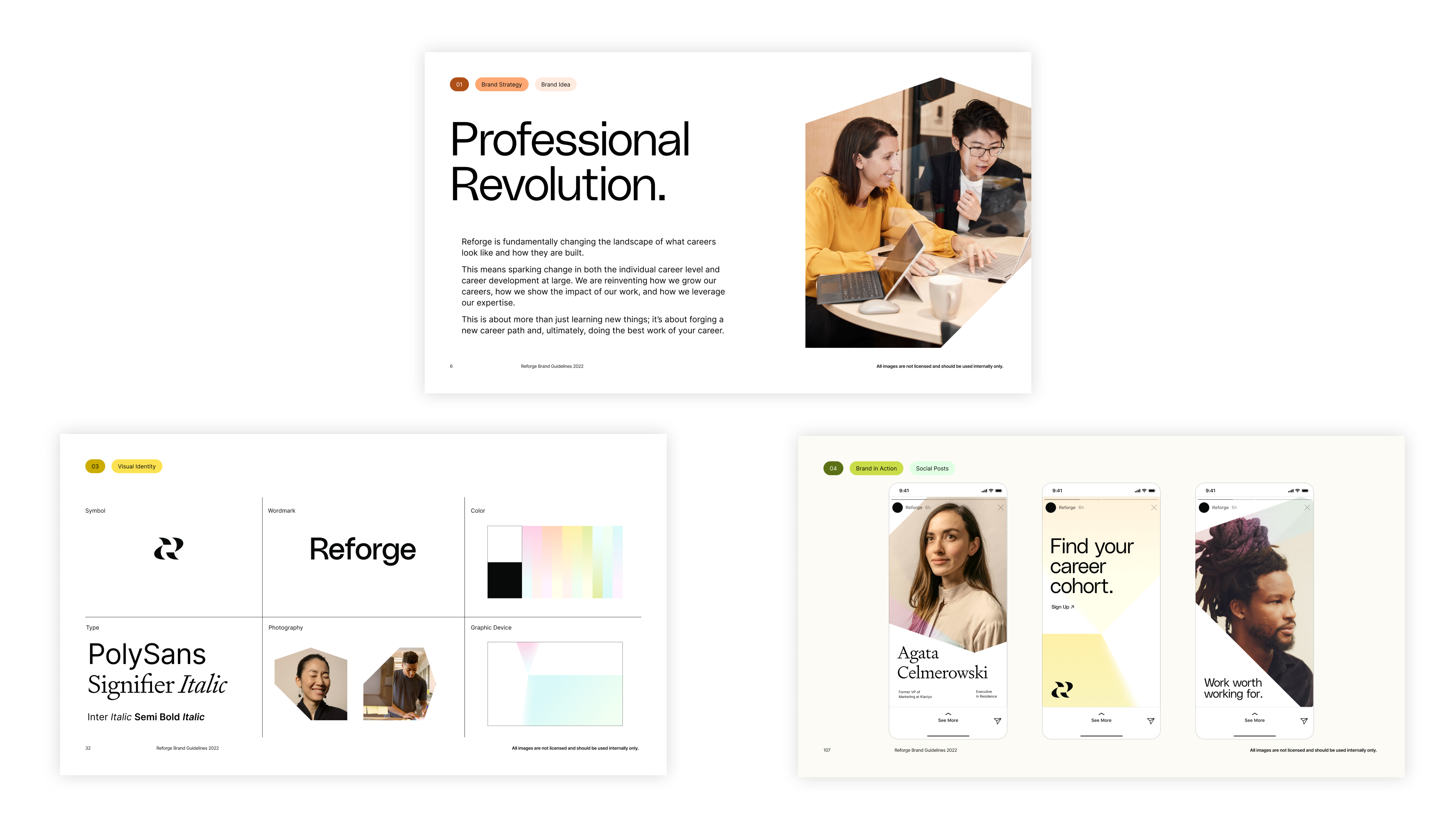
- Rebrand Guidelines: The entire org was given the same guidelines from Koto, a design firm. This included recommended type, colors, and photography guidance. The challenge was figuring out how to incorporate that guidance in a way that would allow the system to seamlessly shift from old to new.
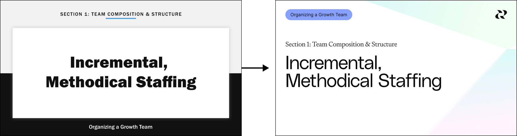
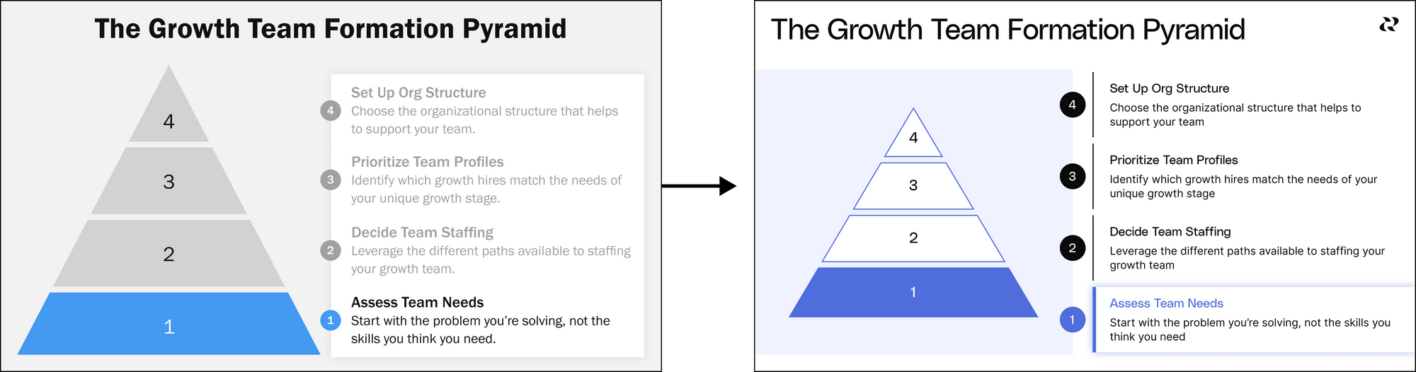
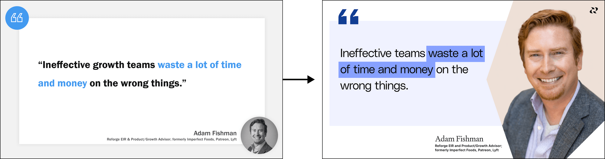
- Volume of Existing Content: Reforge is a content-first company: the content is the product. In this spirit, the new branding and system needed to be applicable to the content first and then to the product. An enormous amount of existing program content was already created with the original design system. The updated design system had to evoke the spirit of the new brand while being similar enough to the original system to retain visual resonance for members and be simple for designers to do a 1:1 conversion of vetted designs.
Approach
We started by exploring different strategies for new styles and approaches using guidelines given by the branding agency Koto.
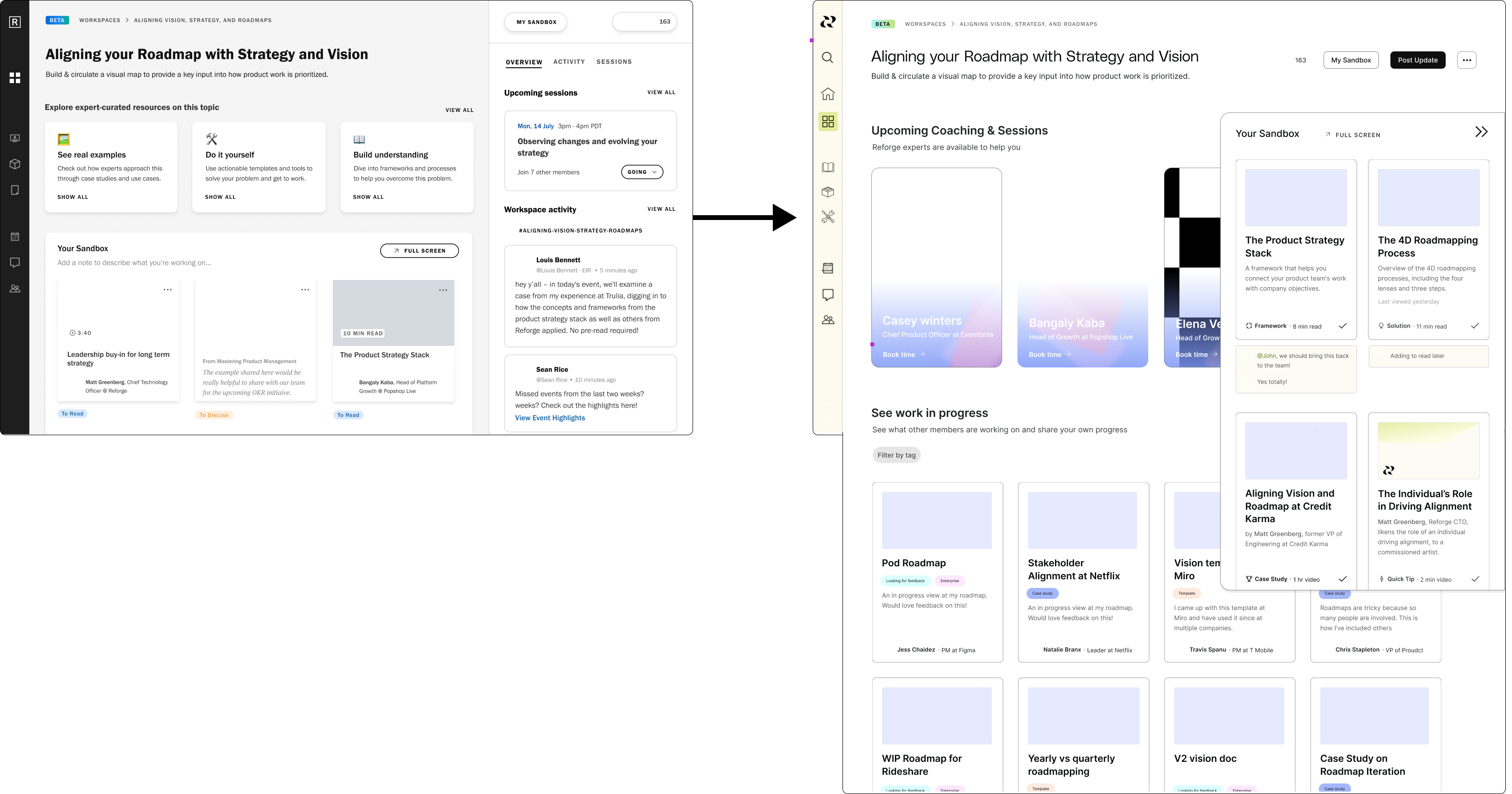
We needed the product and the content the be cohesive in the bigger picture, but still distinct from each other. While product and content shared the same color palettes in the previous system, we decided to create separate primary palettes in the new system to distinguish between them visually.
Product

Content

Research Insights
We took some time in the beginning to research how the Legacy system was being used, mostly through shadowing sessions with designers where we asked them to let us sit in on their working sessions and think out loud while working. We then ended the sessions with brief user interviews.
We came up with a few main insights from these sessions:
- Many designers expressed that it would be easier to just detach the component they were using and edit it themselves from scratch.
- Designers felt bogged down by the volume of design decisions they needed to make.
- Designers didn’t reference the usage guide very much, instead relying on their own experience and instincts to make decisions about component usage and UI patterns.
Journey Mapping to Principles
I also journey mapped what using this system would look like with a designer as the user. What were the expectations of the average user of this system? What steps would they follow when using it? What are current pain points, and how can we correct them? I used those outcomes as principles for designing the new system.
1) Reduce Decision Fatigue
Friction: Designers felt that existing structure could be unclear and put forth too many options, creating friction.
Goal: Create guidance that’s clear enough to reduce decision fatigue among designers. Decisions should be obvious where possible, while leaving room for creativity.
2) Clear + Consistent Guidance
Friction: Components had an unclear taxonomy and naming system in the previous system, leaving room for confusion.
Goal: Develop a clear information architecture for components, and name them using the new taxonomy.
3) Consistent Application
Friction: It was cumbersome to navigate to Notion from Figma to clarify use of components with the Usage Guide. This led to inconsistent use of components.
Goal: Move the usage guide to Figma and make use of metadata to make using the guide simple, which will enhance use and, therefore, consistency.
We then tested explorations, gathered executive feedback and buy-in, and honed in on a specific approach and style.

Visually, the new style needed to be light and airy. It needed a lot of white space, and made heavy use of gradients and fractal shapes. It needed to feel like light passing through a prism and changing, in following Reforge’s mission of helping users exponentially grow in their work and their careers through their programs.

Auditing Functionality
We also took this opportunity to do a full functionality audit and really invest in the UX of the system for designers using it. This involved creating a new information architecture and library structure, finding opportunities to incorporate component properties or nest instances to streamline usability, and testing for validation while also fixing bugs that surfaced from the testing.
.png)
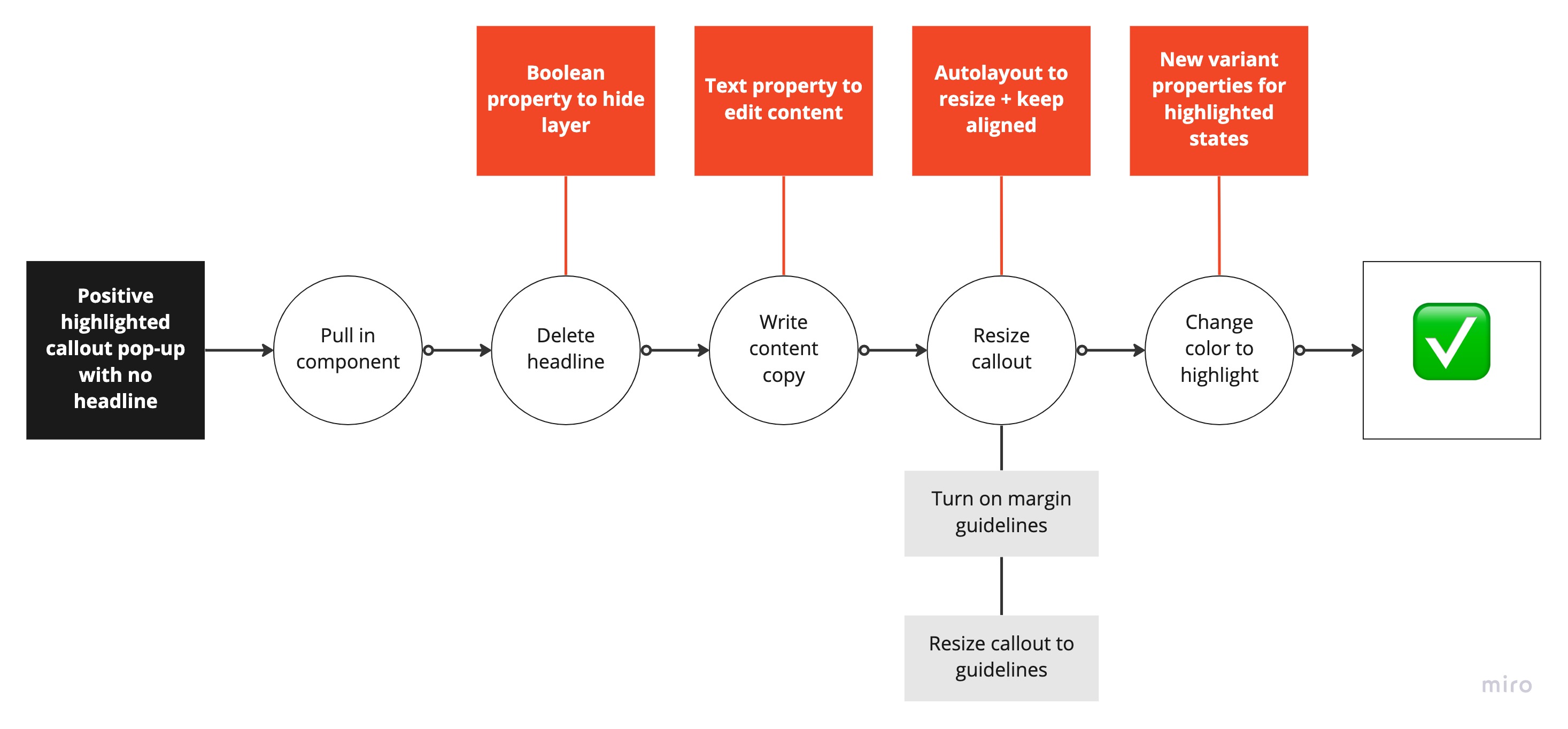
While building out these components, we dug deep into what using this tool looks like on a really functional level. With the goal of completely reworking the structure of our components (following the research insight that designers wish they could just detach their components), we broke users’ processes down step-by-step to really pick apart what they had to do in order to complete tasks using the original system and then problem-solved ways we could streamline those steps to both save time and mental energy.
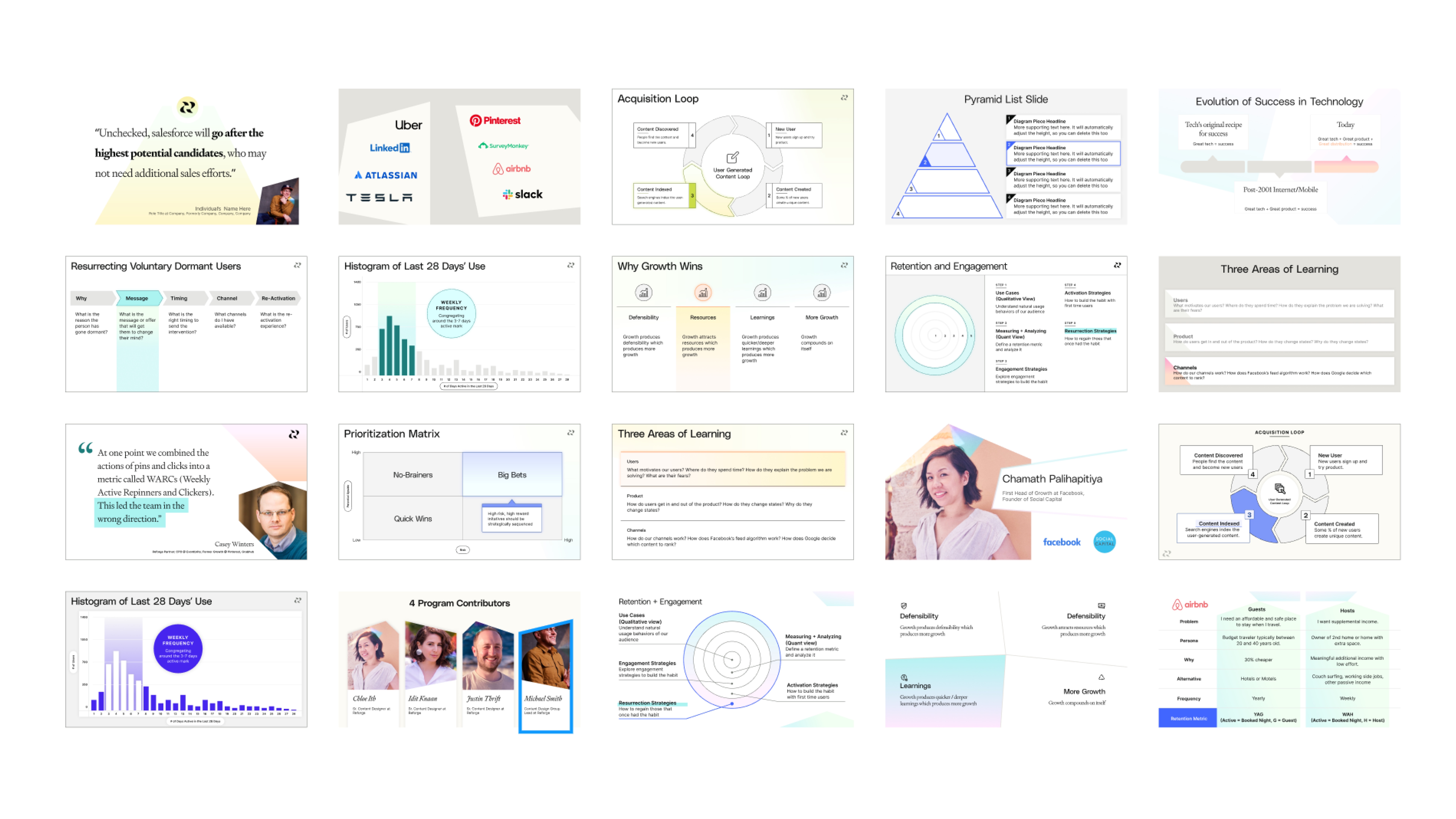
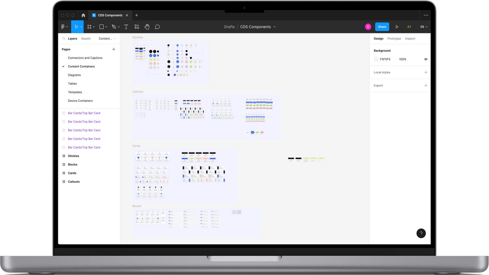
After honing in on a specific style, we built out dozens of functioning templates and components.
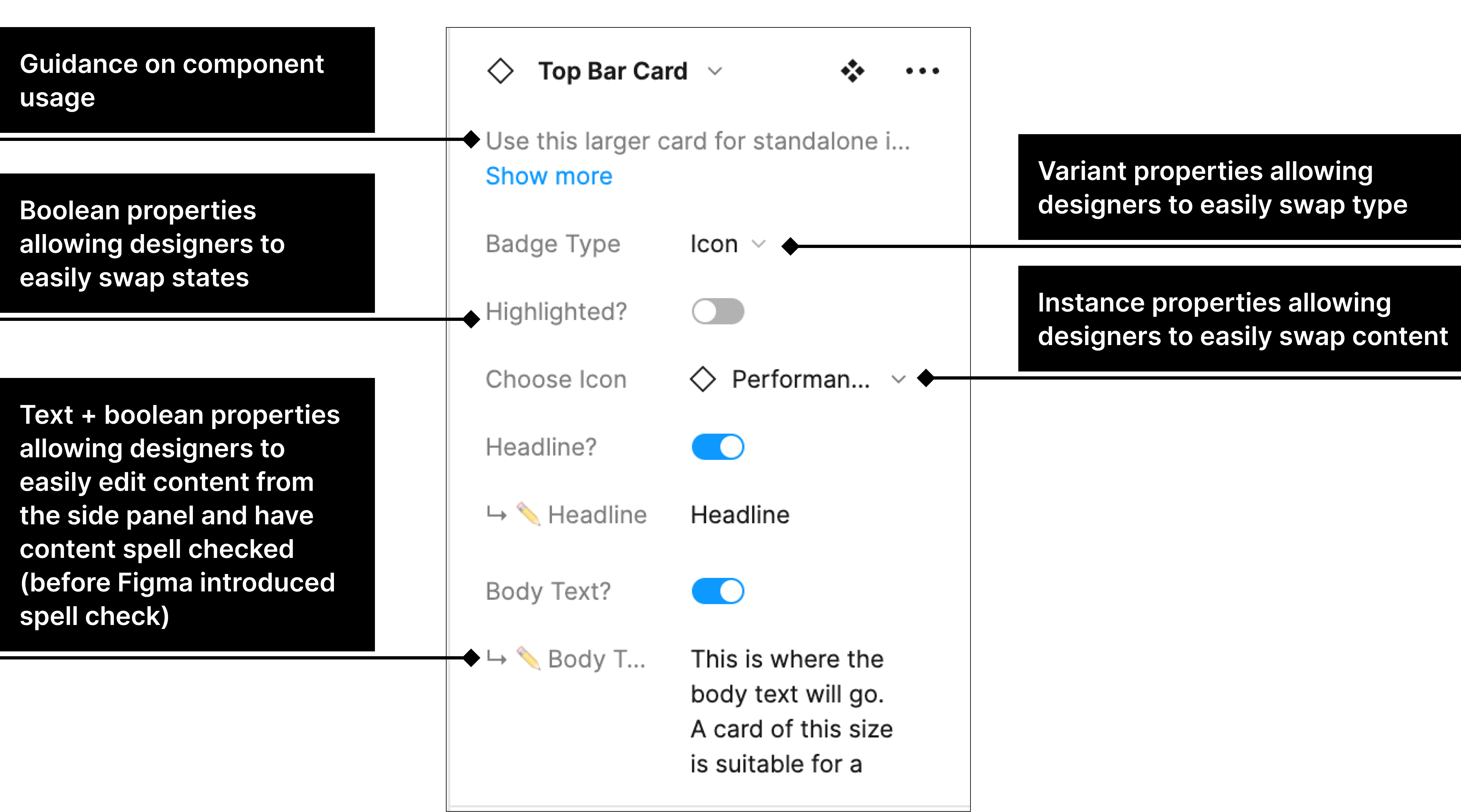
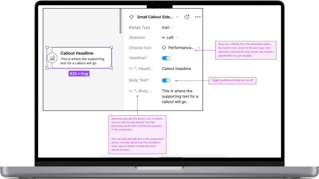
Following the insight that many designers wished they could just detach the components they were using, we decided to completely restructure our components and rebuild them all from scratch. We primarily did this by building in new variant, boolean, instance swap, and text properties. This allowed designers to streamline processes by working primarily from the side design panel.
User Testing
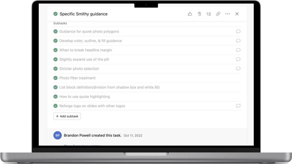
The next phase involved user testing the new system and its components to surface bugs and to test its usability. We used Asana and Notion to keep track of testing, and had users record themselves during testing with Loom so that we could review it later. We were specifically testing the system’s intuitiveness, whether or not we did decrease the amount of decision-making needed from the designer, and for bugs within components.
We also then mapped out a whole new information architecture for the system and organized it into a clear, navigable set of files for designers to use as a resource.


We also built out documentation for clear guidance on how to use the system, demonstrating both how to use the system and processes for making suggestions/requests.
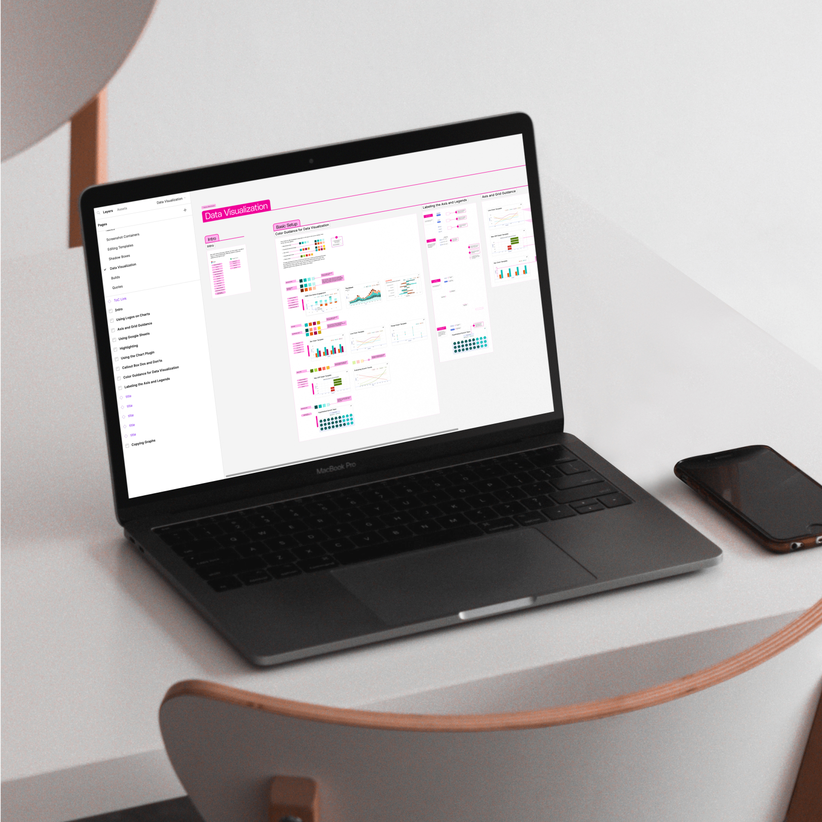
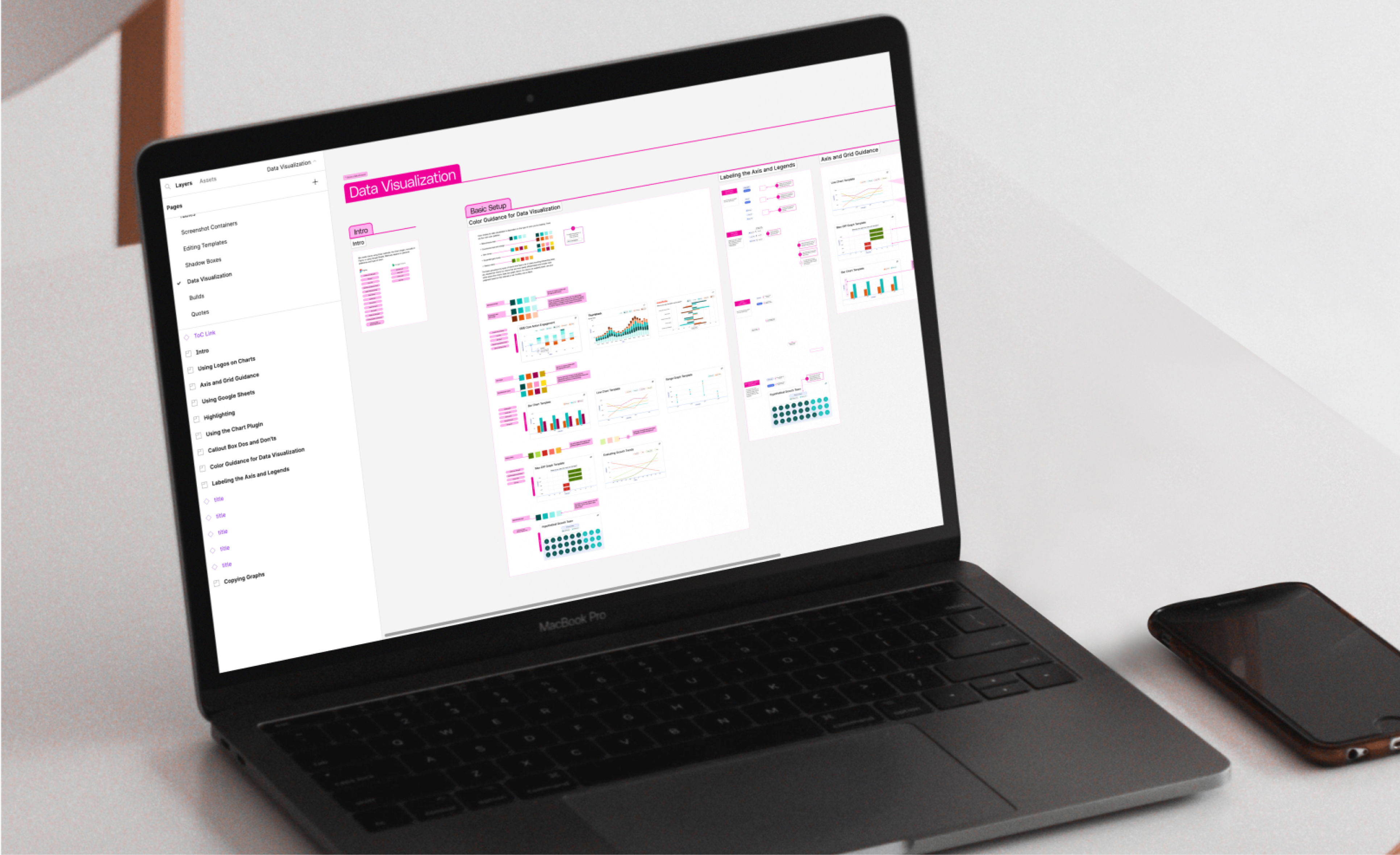
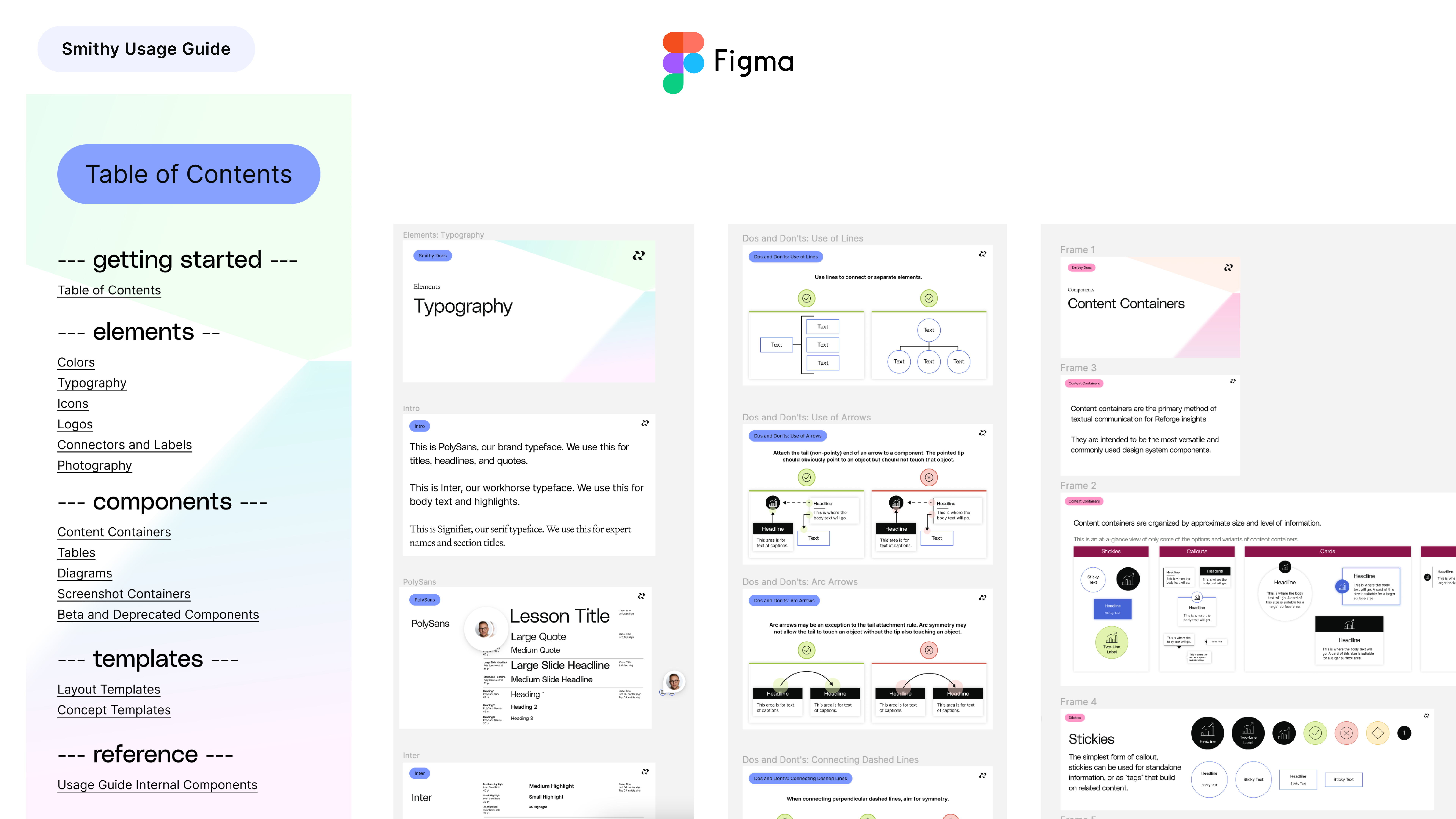
The original system's Usage Guide was housed in Notion, but we decided to build the new guide in Figma instead. This allowed us to keep the guide in its native format, keep the guide up-to-date by connecting it to its original components, link all component instances to their associated guidance in the Usage Guide, and contributed to a culture of continual update and growth.
Impact
Reduced Decision Fatigue
One of my biggest hypotheses and goals in this project was that reducing the amount of decisions users needed to make would both allow them to prioritize higher value decisions, and would through that increase the team’s scalability. The main way we reduced this decision fatigue was through fleshing out all possible variations of each component and having them pre-set so that designers could navigate through them intuitively using various component properties.
Simpler Onboarding for New Hires
The usage guide has the following assets:
• Native to Figma and, therefore, easily navigable
• Incredibly detailed, with thoughtful guidance to reduce decision fatigue and preempt questions
• Includes links to the relevant assets within the design system
All of these assets contribute to easier onboarding for new hires, as well as current designers learning the updated system.

An Internal Product as Thoughtful as an External Product
We started the project with one clear end goal in mind: treating this internal product with the same level of care and attention that we would treat an external product. We wanted to not only revamp the system's aesthetics to match the new brand, but to also put thought and work into its usability for the designers using it. We did this primarily through implementing new component properties, reworking the architecture and organization of the system, and by investing in a fully revamped Usage Guide.