

UX with AI (certification)
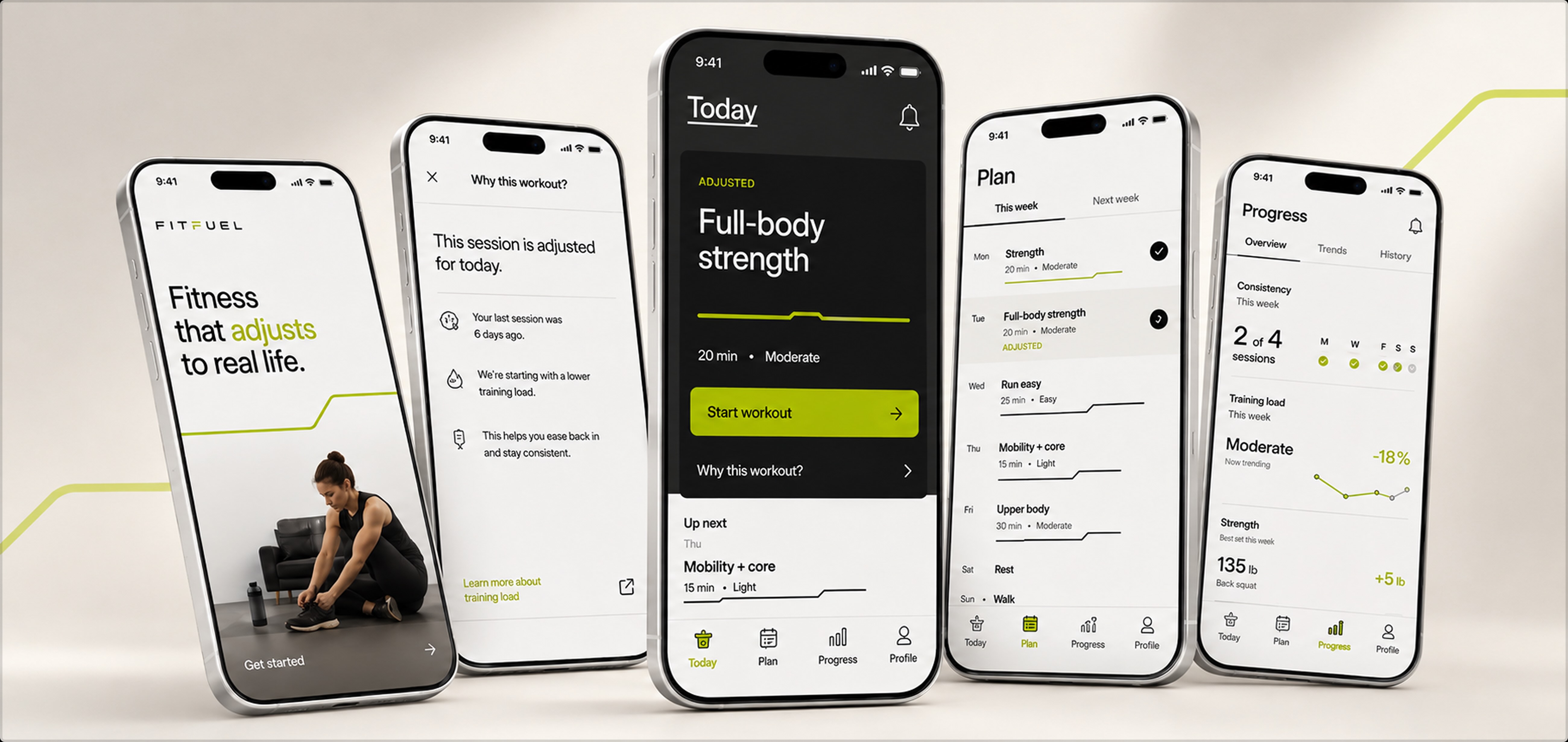
Opportunity
What happens when AI becomes part of the entire design process?
FitFuel was a design exercise for an AI for UX Design certification. I used it to push as much of my normal UX workflow as possible through prompting and AI-assisted tools—from research synthesis and strategy through visual direction and prototyping.
The goal wasn’t to see whether AI could design a product for me. It was to test where it genuinely expanded my process, where it accelerated familiar work, and where human judgment became more important.
The design challenge was fictional. The workflow experiment was real.
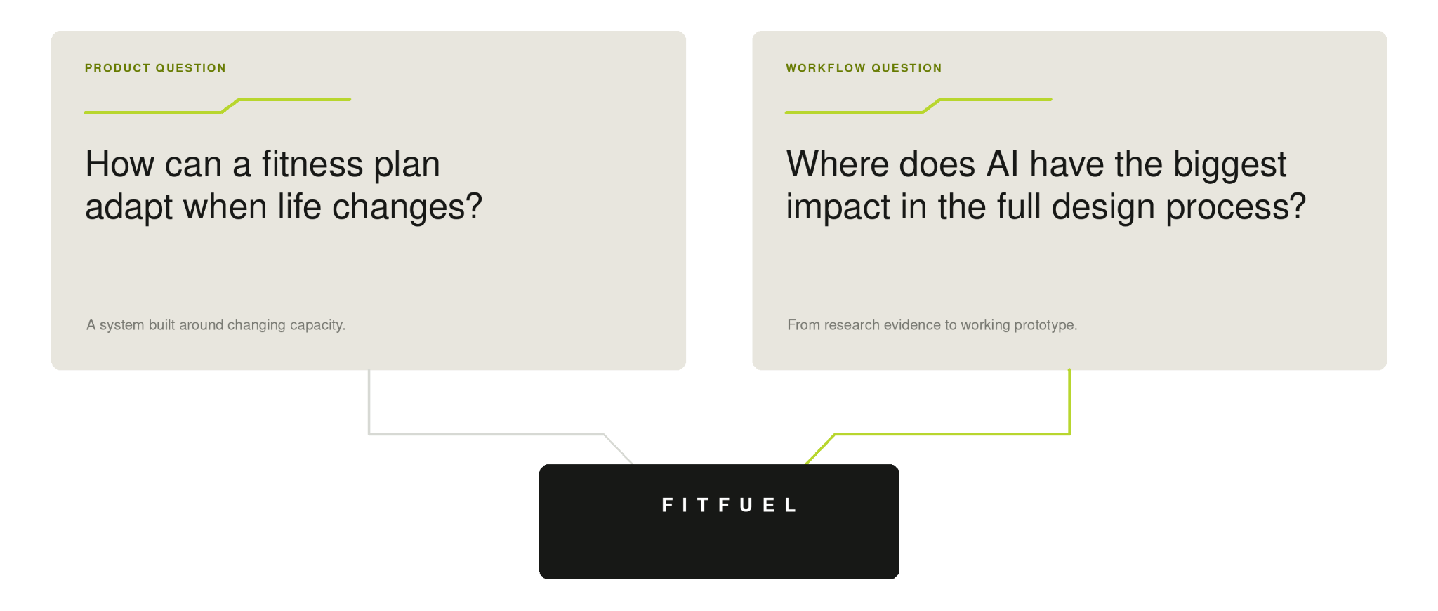
The research pointed away from better plans—and toward more resilient ones.
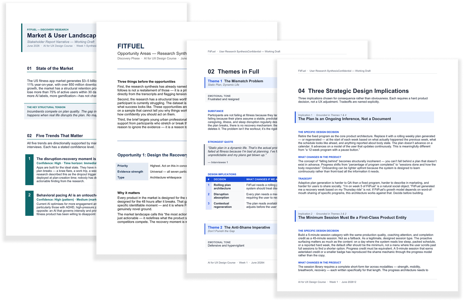
The discovery work included five user interviews, two practitioner interviews, and secondary market research. Across the research, the strongest pattern was not a lack of motivation or workout quality.
People struggled because their fitness plans assumed stable lives.
Work ran late. Travel disrupted routines. Energy fluctuated. Injuries returned. When the original plan stopped fitting, users were left with an irrelevant schedule, a broken streak, or messaging that made the disruption feel like failure.
The opportunity shifted from:
How do we create a better personalized fitness plan?
to:
How do we create a plan that survives real life?
The research also changed how I thought AI should appear in the product.
Participants were skeptical of “AI-powered” experiences that wrapped generic recommendations in new language.
What built trust was specificity: the product behaving differently because it understood something relevant about the user—and explaining that decision when needed.
That created a second design question:
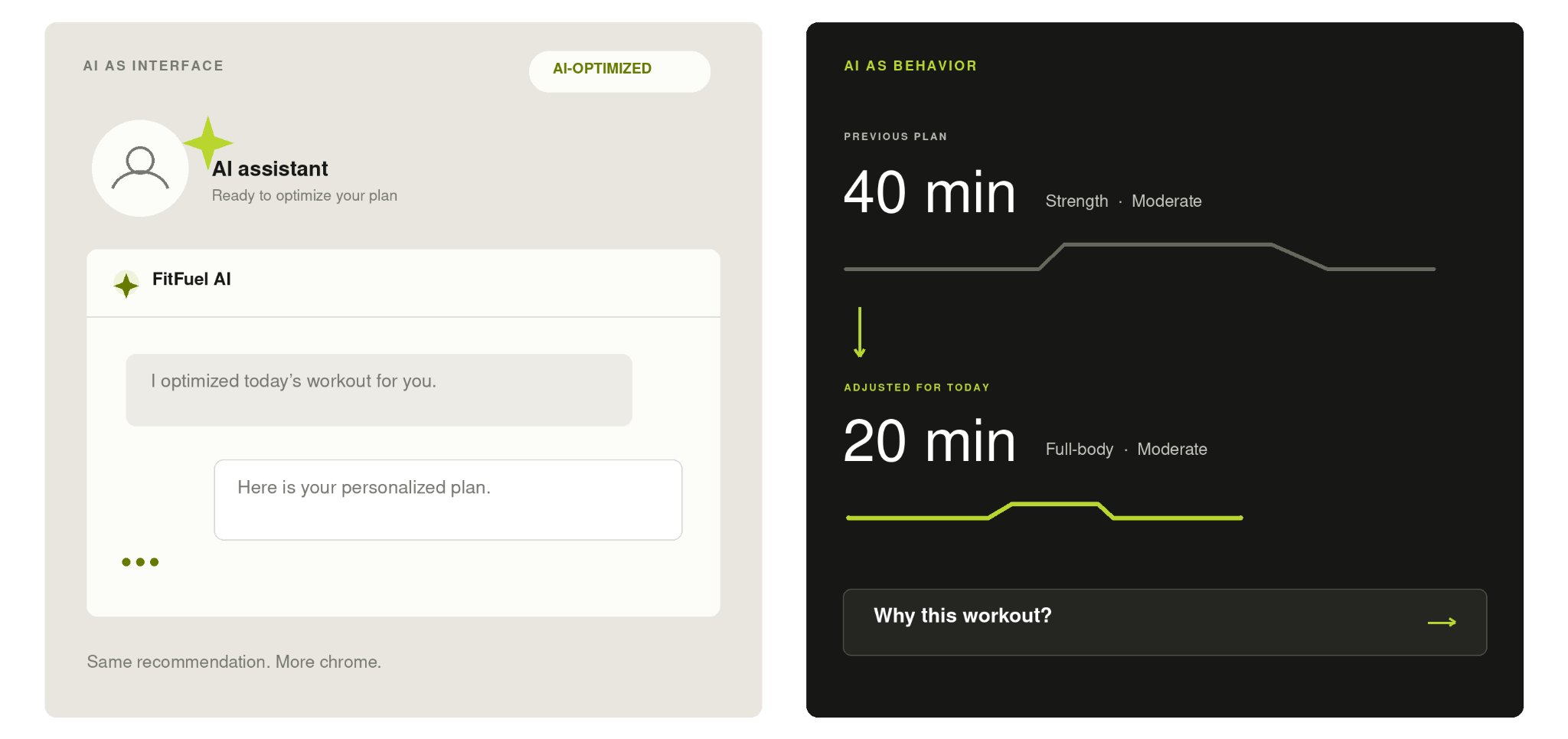
Could AI be experienced through product behavior instead of an AI interface?
No chatbot coach.
No assistant avatar.
No sparkle icon.
No “AI optimized this for you.”
Instead:
The recommendation changes because the context changed.
.png)
Approach
I gave AI a different job at each stage of the process—and kept a different kind of human judgment in the loop.
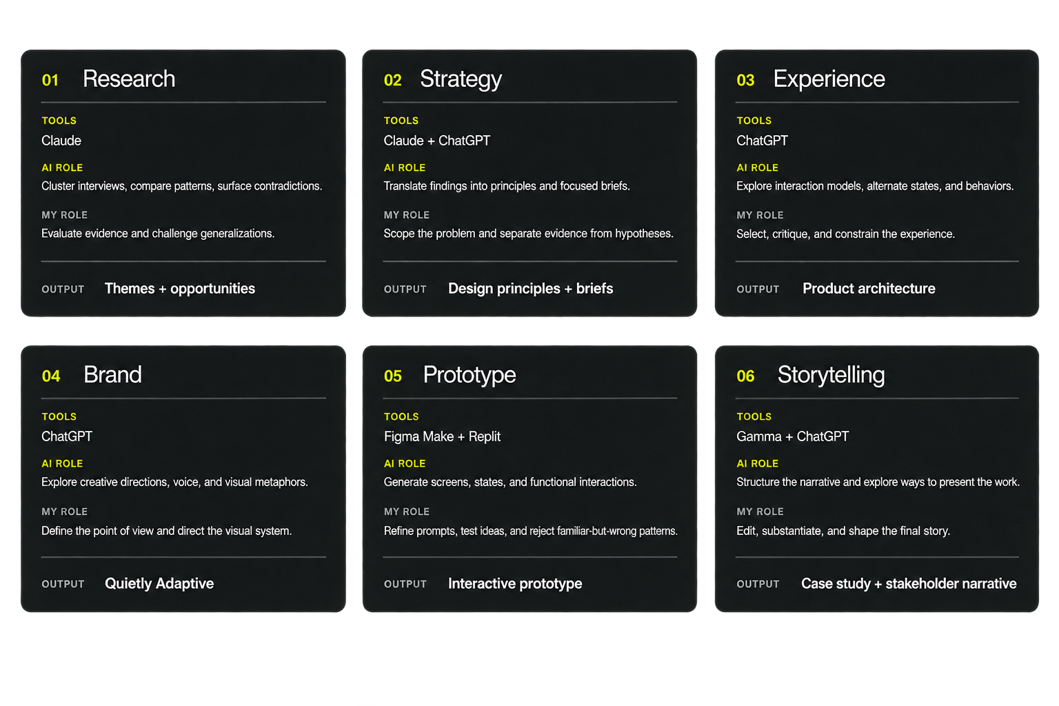
1. AI as synthesis partner
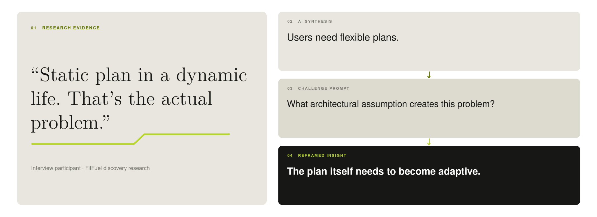
AI made synthesis faster. It also made weak conclusions easier to overstate.
I used AI to compare interviews, cluster recurring themes, identify contradictions, generate personas, and build journey maps.
But one of the clearest lessons came from what AI did too well: it could turn messy qualitative evidence into a persuasive, coherent story almost instantly.
So I deliberately prompted it to challenge its own conclusions:
- Which findings were universal?
- Which appeared in only one interview?
- Where did participants disagree?
- What was a design decision rather than a research finding?
- Which voices were absent from the dataset?
That process helped preserve the distinction between evidence, interpretation, and hypothesis.
The final synthesis explicitly documents its discovery-sample limitations and research gaps rather than presenting them as resolved truths.
2. AI as constraint generator
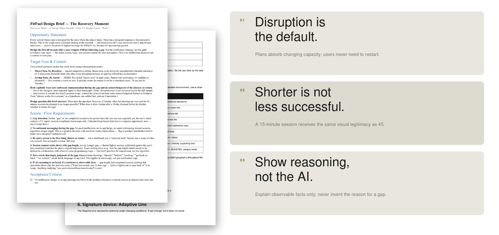
Before generating screens, I used AI to turn research into constraints.
The research was translated into focused design briefs before visual exploration began.
Those briefs defined not only what the experience should do, but what it should deliberately avoid:
Disruption is the default.
The plan should absorb change rather than require users to restart or catch up.
Shorter is not less successful.
Reduced-duration sessions should feel like legitimate recommendations, not fallback content.
No guilt or comeback framing.
A return after a gap shouldn’t become an emotional event.
Show the reasoning, not the AI.
Recommendations can explain observable facts without pretending to understand why the user’s circumstances changed.
These constraints became a guardrail against one of the biggest risks of generative design: producing polished interfaces that quietly revert to familiar product conventions.
3. AI as creative direction partner
The product behavior became the visual idea.
The research suggested a product that should feel capable without being performative, adaptive without being chaotic, and supportive without becoming motivational.
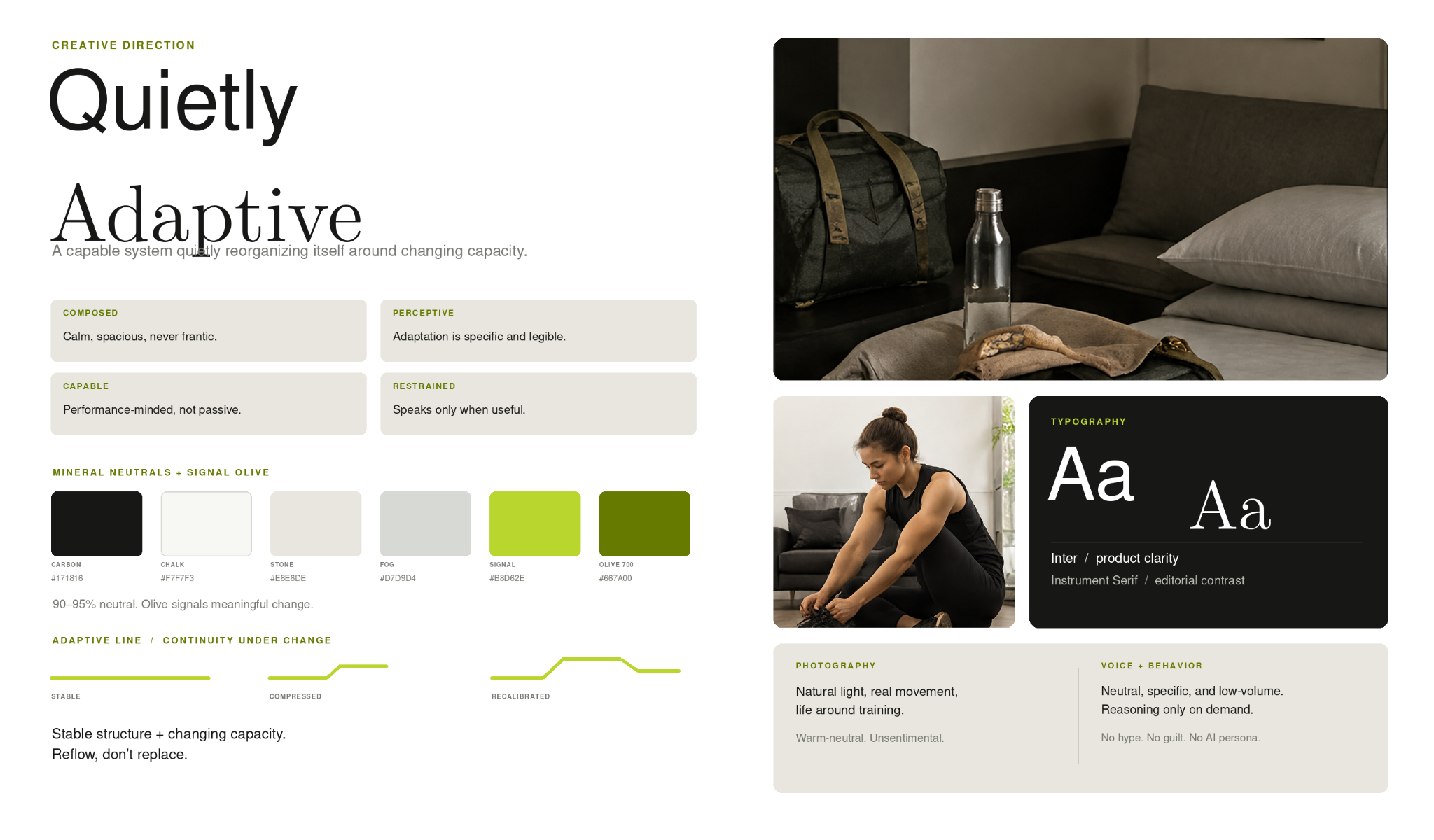
Through AI-assisted creative exploration, I developed the direction:
Quietly Adaptive
The system stays composed while selected elements stretch, compress, redirect, or reconfigure around the user’s changing capacity.
That idea became both a visual identity and an interaction principle.
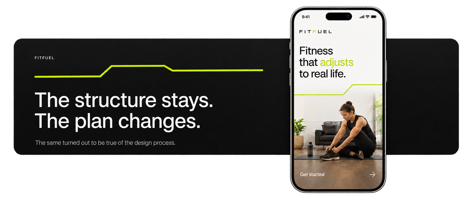
The signature Adaptive Line represents continuity under changing conditions. It can contract, expand, or redirect—but never break.
The structure stays. The plan changes.
The visual system translated that idea into a restrained palette, editorial typography, sparse use of acid olive as a signal, low-volume copy, and interfaces that prioritize one recommended action over dense dashboards.
4. AI as prototyping and critique tool
Instead of giving AI a persona, I made adaptation visible in the interface.
The prototype centered the Today experience around one question:
What makes sense right now?
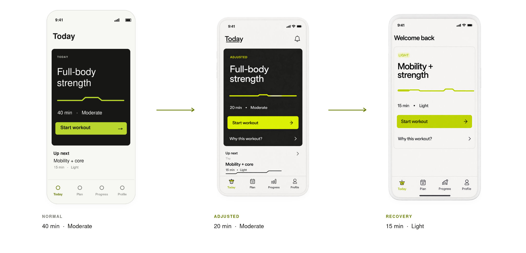
A normal 40-minute strength session can contract into a 20-minute full-body workout when conditions change.
After a longer gap, the recommendation can reduce further into a lighter recovery session.
The user doesn’t switch into a recovery mode or restart a program.
The system simply recalibrates.
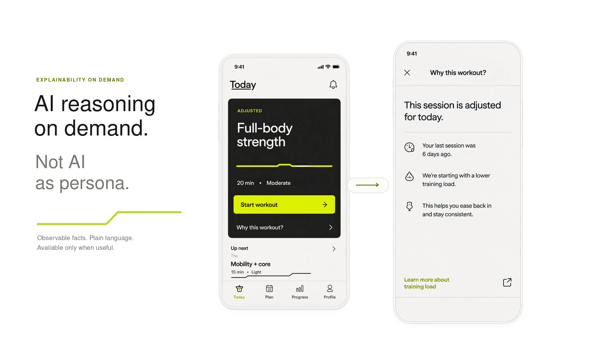
Reasoning is available on demand—not constantly announced.
Rather than explaining every adaptation proactively, FitFuel uses a secondary Why this workout? interaction.
The explanation is limited to what the system can actually observe: previous session timing, current training load, and why the recommendation changed.
It does not infer that the user is stressed, busy, discouraged, or unmotivated.
This made explainability part of the experience without turning AI into the experience.
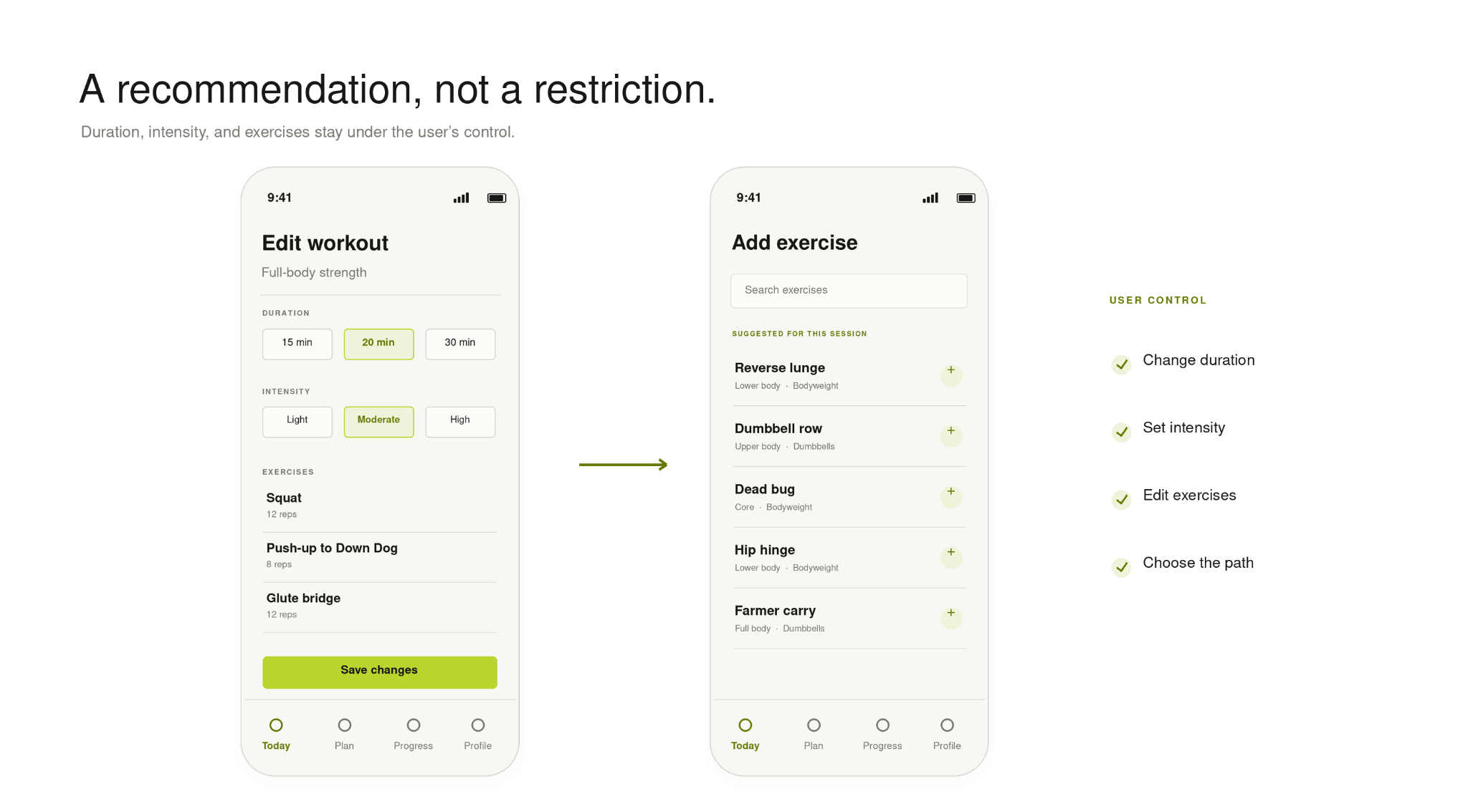
AI recommends. The user remains in control.
Reducing decision overhead shouldn’t mean removing agency.
FitFuel presents one clear recommendation first, but users can still change the workout, duration, intensity, exercises, or session style.
A recommendation, not a restriction.
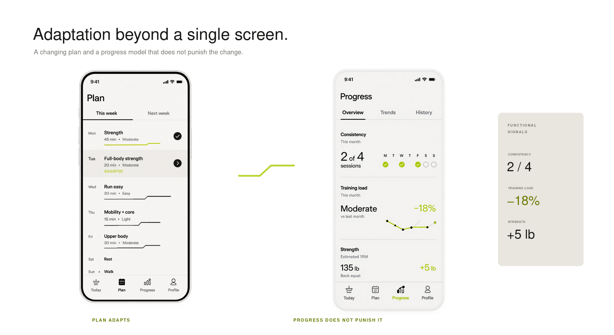
Adaptation became a system, not a feature.
The same principles extend beyond the Today screen.
The weekly plan can visibly reconfigure without appearing broken. Progress focuses on functional signals like consistency, training load, and strength trends rather than defaulting to weight, calories, or transformation metrics.
The goal was to make adaptation part of the product architecture—not a special feature users activate when something goes wrong.
Visual: Plan + Progress side-by-side
Plan adapts. Progress doesn’t punish the adaptation.
.png)
Impact
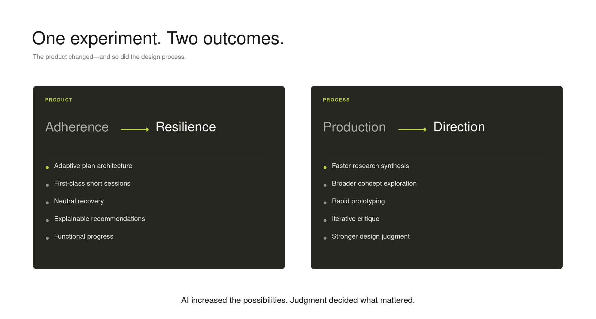
One experiment produced two outcomes.
FitFuel became a coherent product concept demonstrating how adaptive intelligence could operate without becoming a visible AI layer.
But the more important outcome was understanding how AI changed my own design process.
Product
From adherence → resilience
- adaptive plan architecture
- first-class shorter sessions
- neutral recovery
- explainable recommendations
- user override and control
- functional progress metrics
Process
From production → direction
- faster synthesis
- broader exploration
- quicker translation from research to artifacts
- rapid prototyping
- iterative critique
- more time spent framing, selecting, and refining
Across the project, AI helped me move faster between:
evidence → interpretation → strategy → exploration → execution → critique
It dramatically lowered the cost of generating possibilities.
That shifted more of my effort toward framing, selection, critique, and judgment.
AI increased the possibilities. Judgment decided what mattered.
The best AI experience wasn’t an AI interface.
This project changed how I think about designing AI products.
The most convincing expression of intelligence was rarely an AI-specific interface. It was the moment the recommendation quietly changed in a way that made sense.
That led me away from chatbot patterns, AI labels, and “magic” visual conventions and toward legible product behavior.
The question became less:
“How do I show the user that this is AI?”
and more:
“Can the user tell the system understood them?”
The same lesson applied to my own workflow.
AI was most useful when it became part of the process rather than the subject of it—helping me synthesize, generate, challenge, iterate, and explore more broadly.
But making generation nearly frictionless increased the importance of having a strong point of view.
When possibilities are cheap, the designer’s value shifts toward framing the right problem, recognizing what is meaningful, rejecting what is merely plausible, and knowing when the tool is confidently wrong.
.png)