Vaer: A Design Study in Mobile Commerce
Opportunity
This was the second capstone project from Springboard curriculum.
Vaer is a conceptual company that sells modern furniture and home decor on their mobile-web platform. They need to enhance their browsing and checkout experience to greatly improve their product’s usability.
The Problem
Research has shown that a majority of shoppers do not complete their online mobile purchases. 50% of users open on average 7 item pages and then abandon the site without moving any items into the cart. Additionally, 70% of users who place an item in the cart do not purchase. Data shows that users abandon the cart at the registration page. How might we encourage shoppers to feel confident in completing their purchase?
The Solution
A project brief was provided with a problem space, a few very low-fidelity wireframes and user flows, and some preliminary research. I decided to conduct further discovery research, including a competitive analysis, interviews, and designing personas, to pinpoint the reason users were not completing purchases. I then ideated solutions, designed a prototype, and carried out usability testing to validate those hypotheses.
My Role
Branding / User Research/ UX Design / Wireframes / Visual Design / Interaction Design / Prototyping / Usability Testing
Tools Used

Approach
In the project brief, three main statistics stood out:
1. 50% of users open on average 7 item pages and then abandon the site without moving any items into the cart.
2. 70% of users who place an item in the cart do not purchase.
3. Users abandon the cart at the registration page.
If a shopper is taking the time to browse and even decide on items to purchase, what is stopping them from completing their transaction?
I then identified 5 potential users and conducted interviews to gain insight into their shopping strategies. In each interview we went through a series of warm-up questions, and then interviewees shared their screens while we went through a shopping flow on an existing website or app together.
Insights from User Interviews
Photographs are the most important factor in whether or not a user will consider purchasing an object, especially when making larger purchases (like furniture).
Reviews are second most important and are usually the deciding factor in whether or not the purchase is actually made.
UX and UI both need to be simple, clear, and appealing to build trust.
Users hesitate to make a purchase if they can’t envision the item in a space.
New users are much less likely to make a purchase if they are required to make an account to check out.
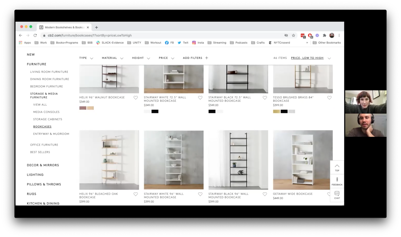
"If a lot of people have bought it and it's well-reviewed, I'm inclined to just buy it and trust it.
Personas
Rachel
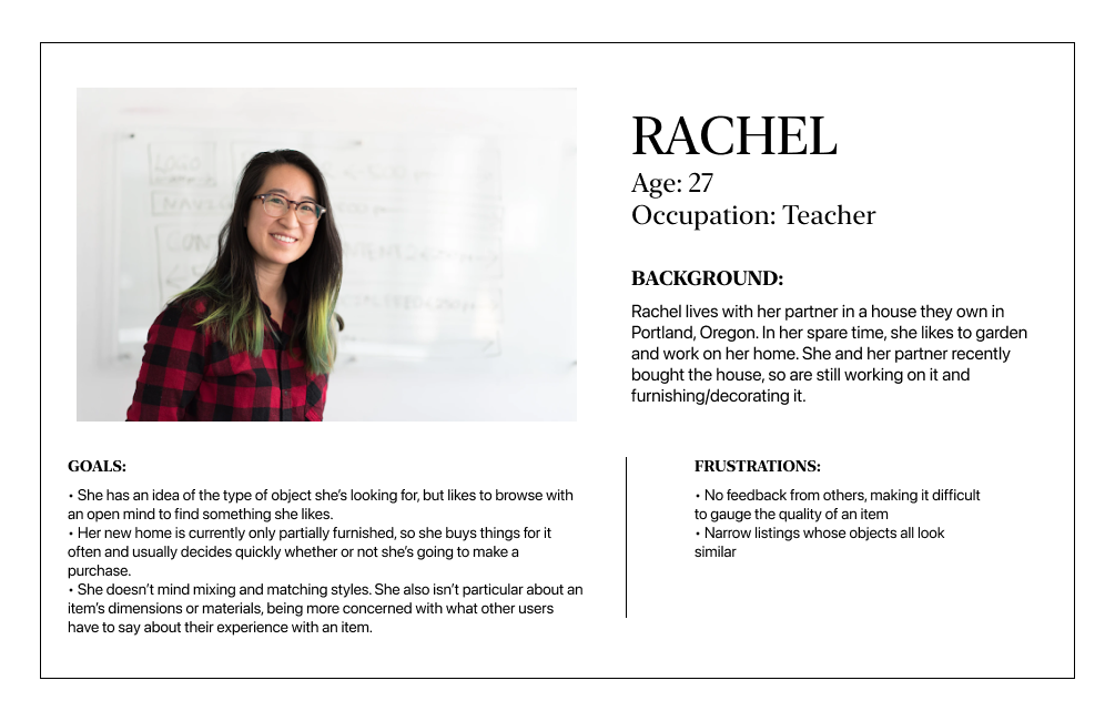
Rachel isa 27 year old teacher who lives with her partner in Portland, Oregon. They just bought their first house together and have their hands full renovating and furnishing it. She knows what kind of object she is looking for when she shops, but she likes to browse and see what's out there. Her house is currently mostly unfurnished, so she decides quickly whether or not she's going to make a purchase.
Richard
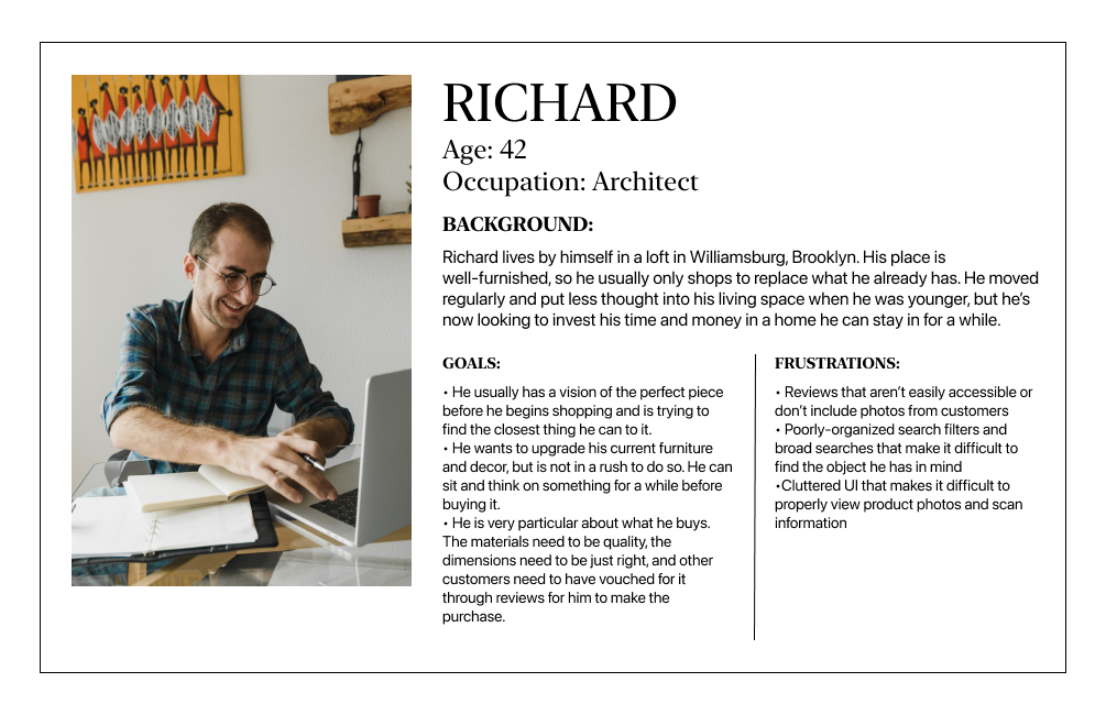
Richard is a 42 year old architect living by himself in Williamsburg, Brooklyn. His place is fully furnished, so he only shops to replace what he already has. He's very picky about what he buys. He usually has a clear image in his mind of what he's looking for, and is trying to find the closest match to that he can. He is in no rush to buy his new furniture and decor; his place is furnished, so he can sit and think on a piece for a while before buying it.
Applying the Research
Using the research I conducted, I came up with a few hypotheses for Vaer's low conversion rates:
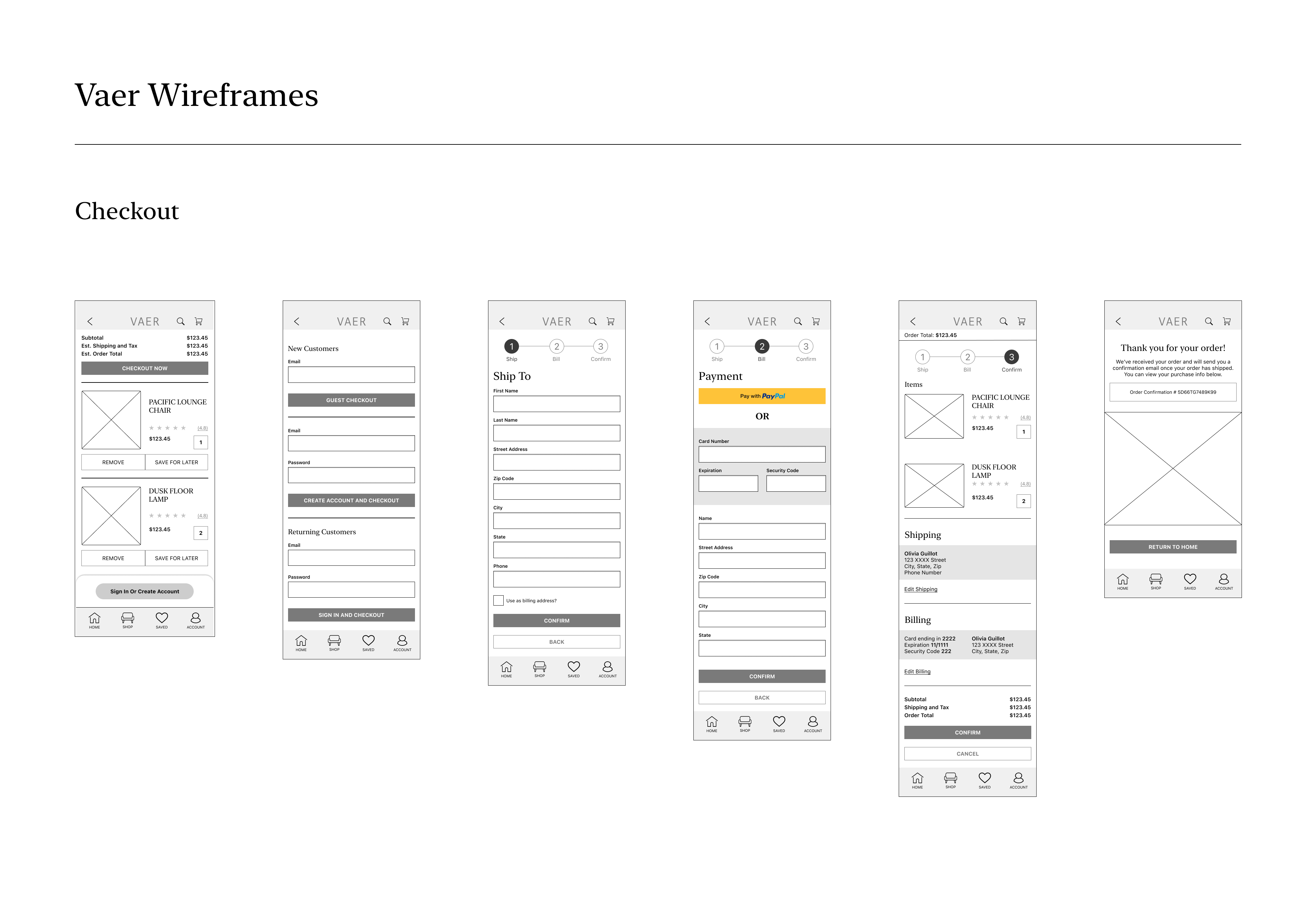
1. Vaer's checkout flow required users to create an account in order to checkout. I believed that designing a new flow that allows users to checkout as guests would increase the amount of completed transactions.
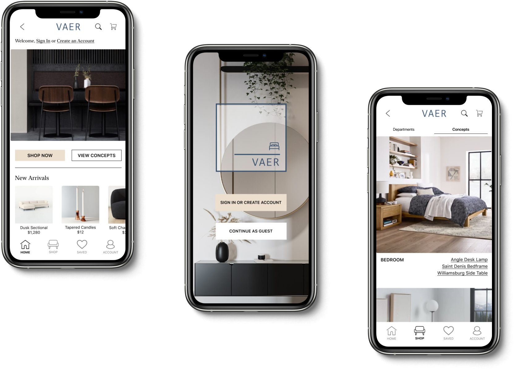
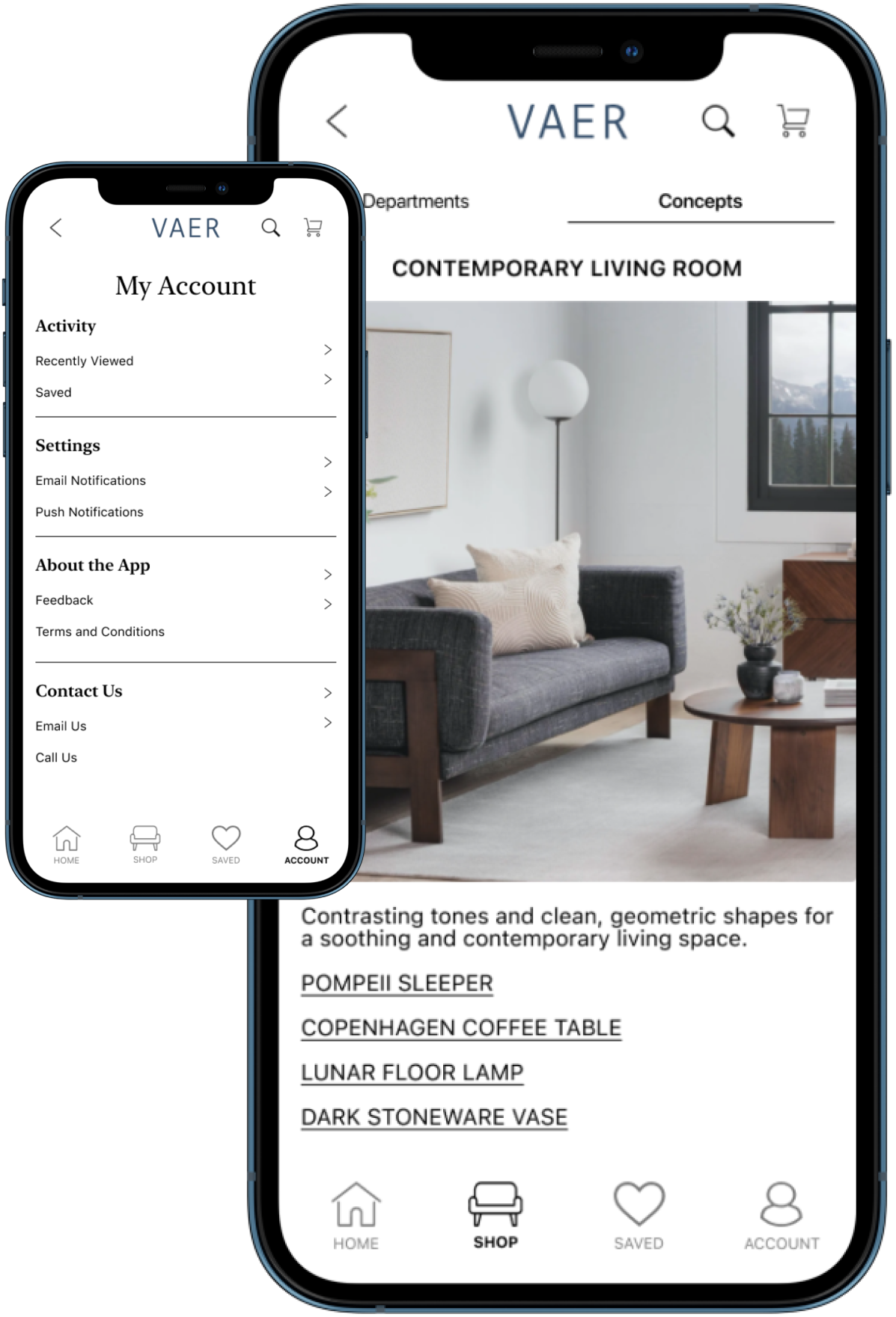
2. If it's difficult for users to envision an item in their own space, they are less likely to purchase the item. I ideated a "Concepts" page that users could reference to see the item they are considering purchasing in an interior space.
3. Users rely heavily on reviews and review photos from other users when deciding whether or not to go through with a purchase. In Vaer's initial wireframes, reviews were not easily available to users. I hypothesized that highlighting reviews and making them easily accessible would increase Vaer's conversion rates.
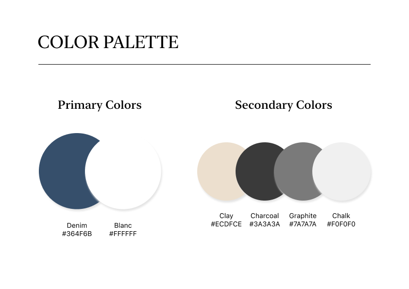
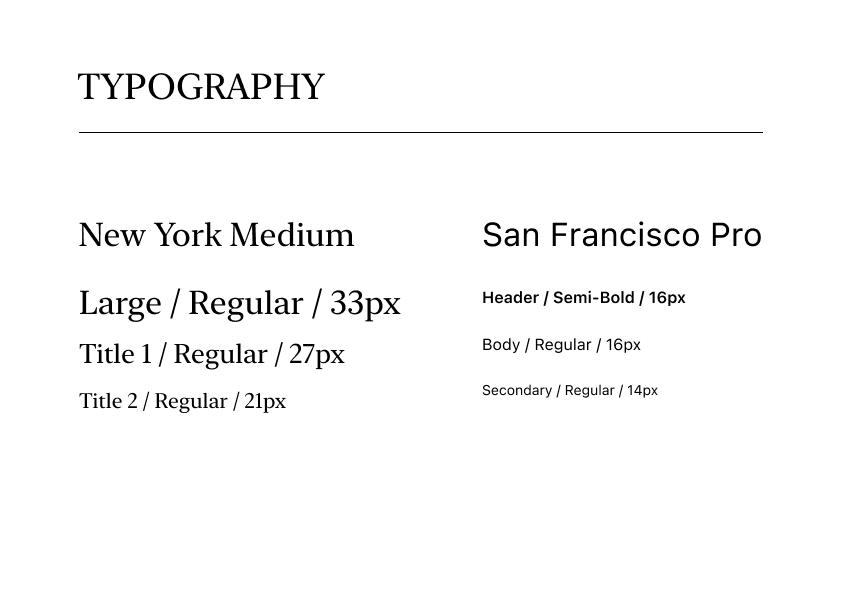
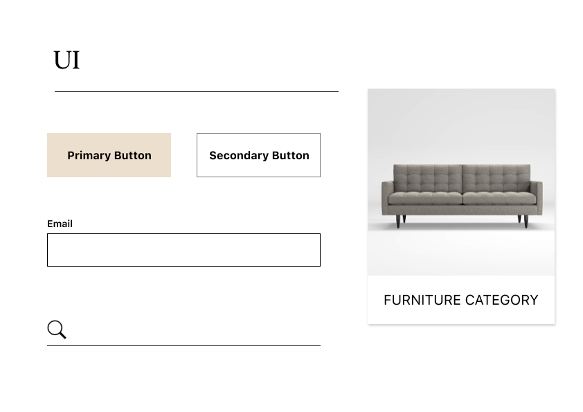
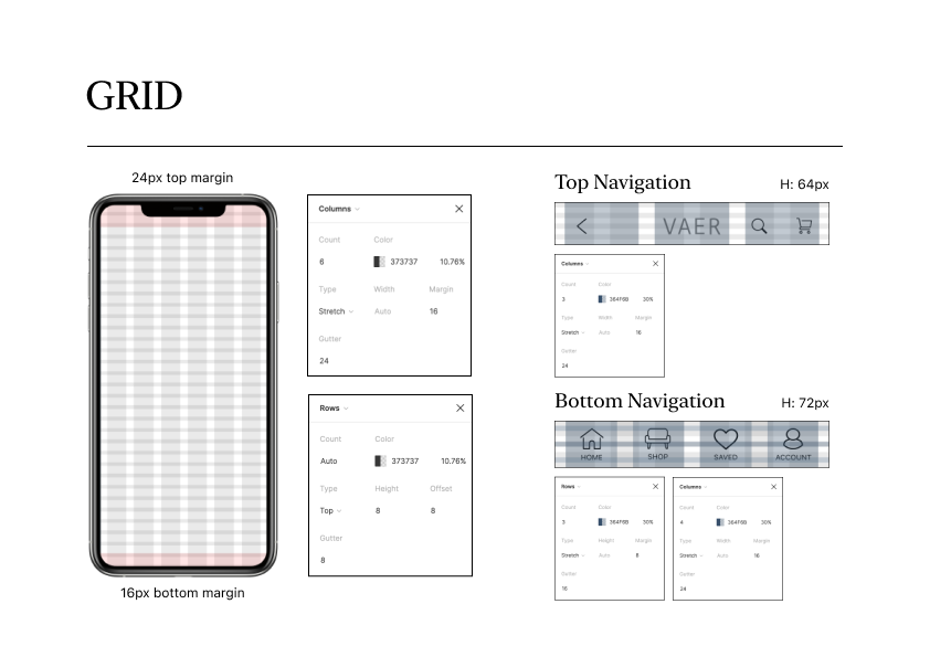
Style Guide
User Flows

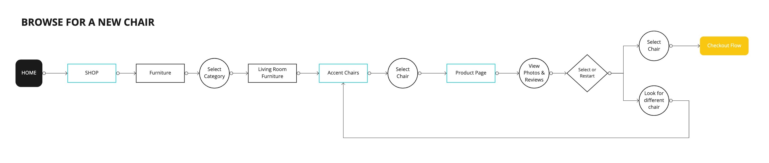
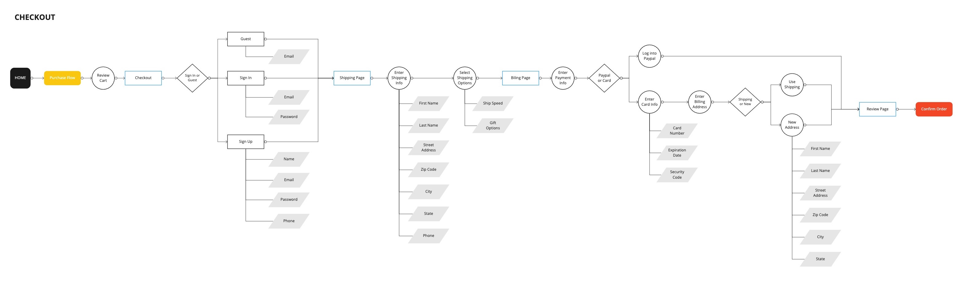
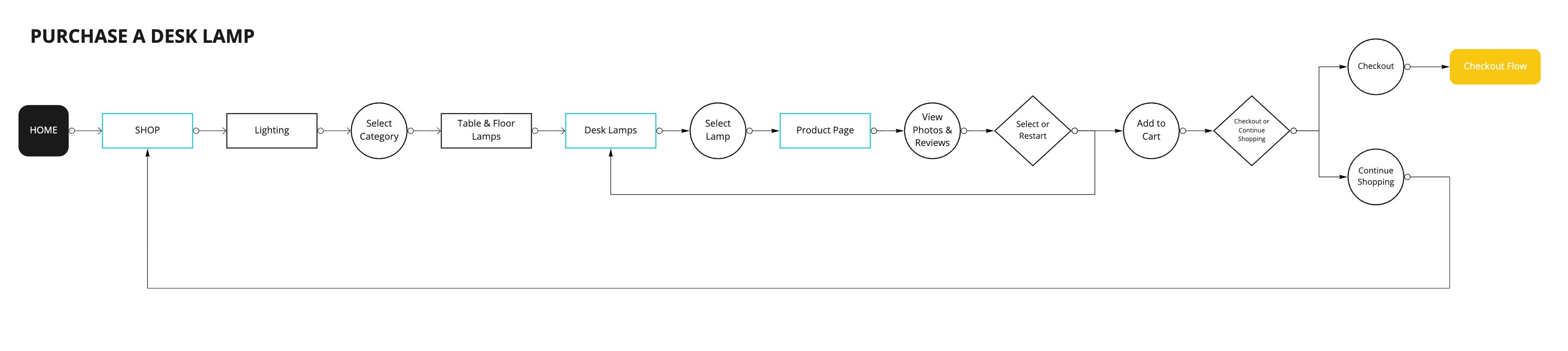
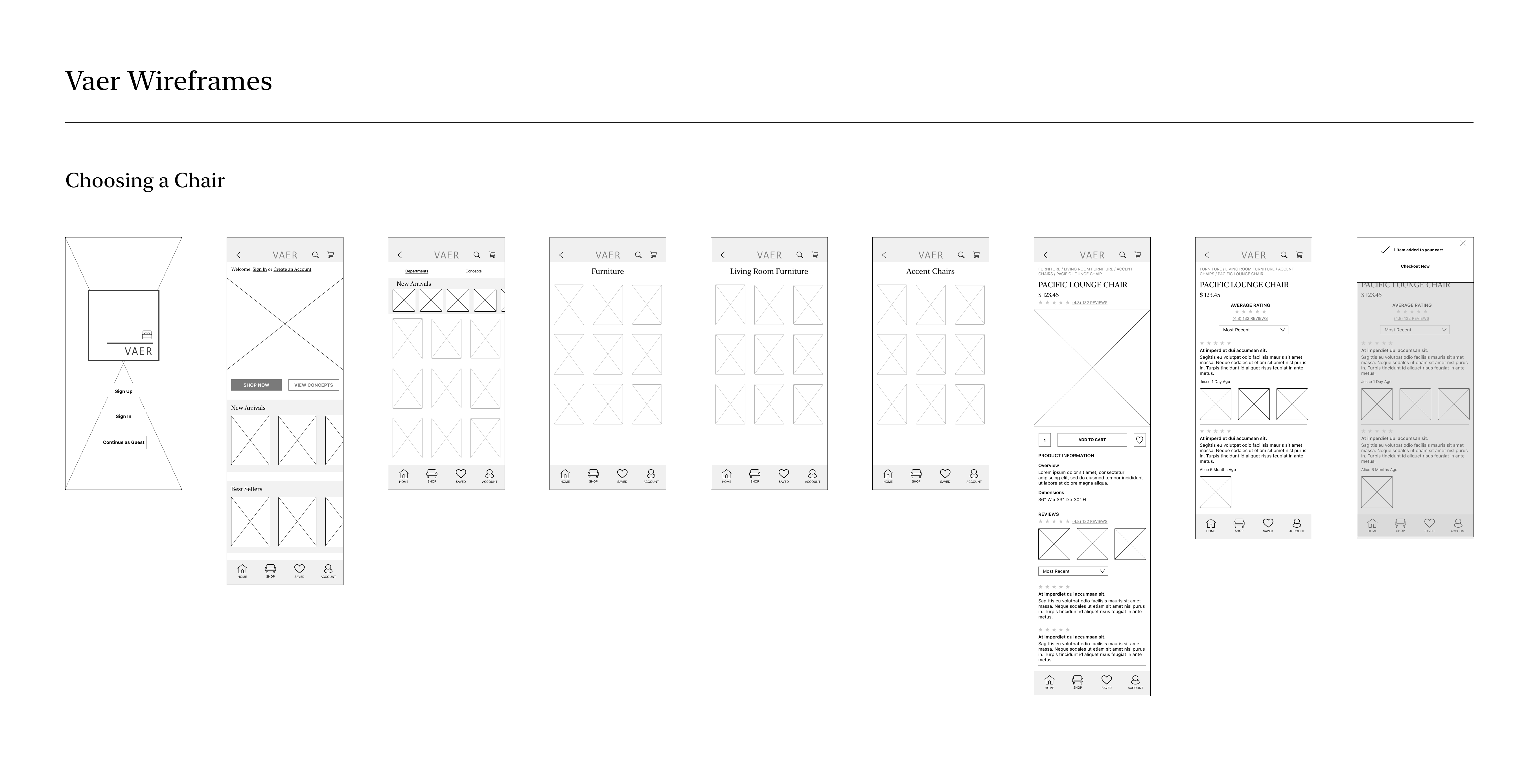
Wireframes
Goals:
- Highlighting user reviews.
- Designing a “Concepts” feature that would allow users to view products in a designed space.
- Designing a new checkout flow that allows users to checkout without creating an account.
Impact
High Fidelity
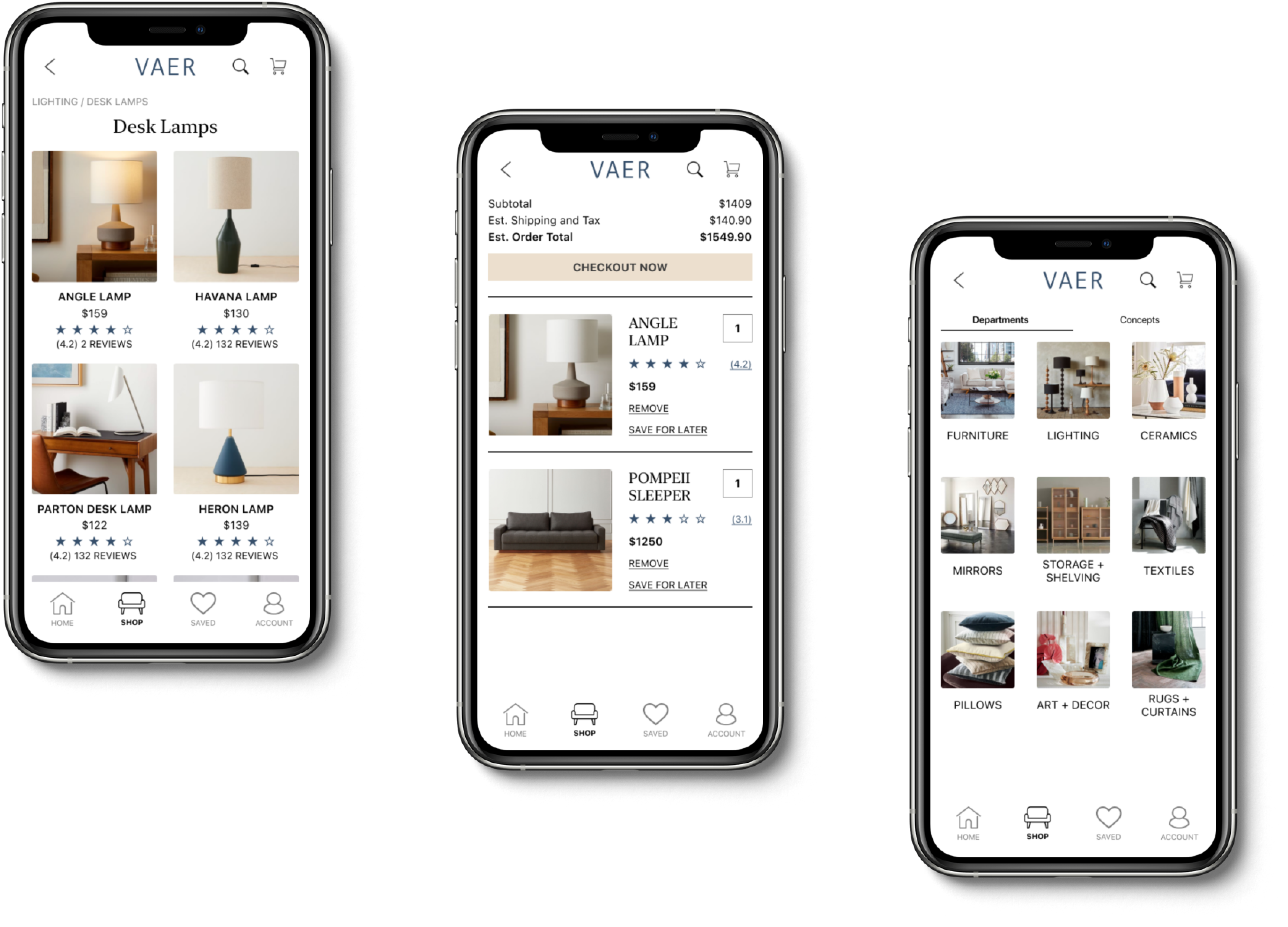
Browse by Category
View Items in a Designed Space
Easily View Reviews and Photos from Other Customers
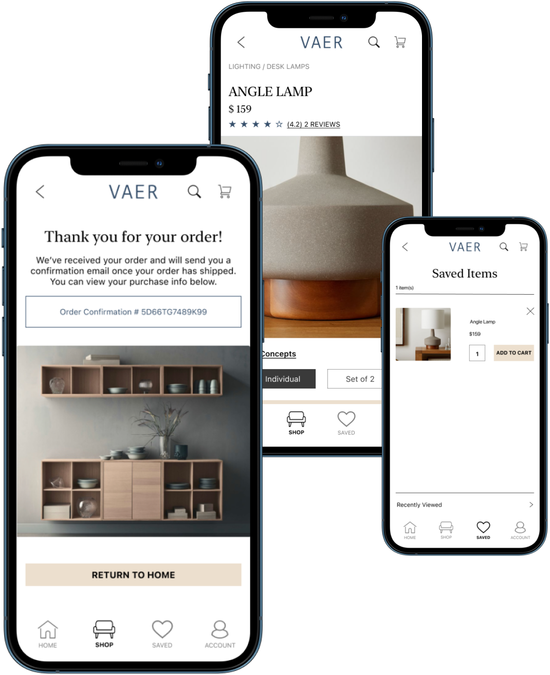
Checkout Easily as a New or Returning Customer
View the prototype in Figma here